Your Right to Spin-Free Data on Covid-19 — August 6, 2020 Update
With a heavy emphasis on graphs and forecasting, and no politics.
These data presentations grew out of my frustration at not being able to find accessible data without heavy doses of political commentary. Just let me see the data! I’ll make up my own mind about the politics. I know others want that too.
The data used to create the graphs in this article is all readily available from the Covid Tracking Project and JHU. More graphs and charts are available at stevemcconnell.com/covid.

National-Level Signs of Improvement
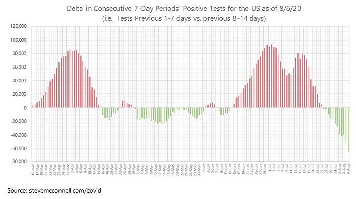
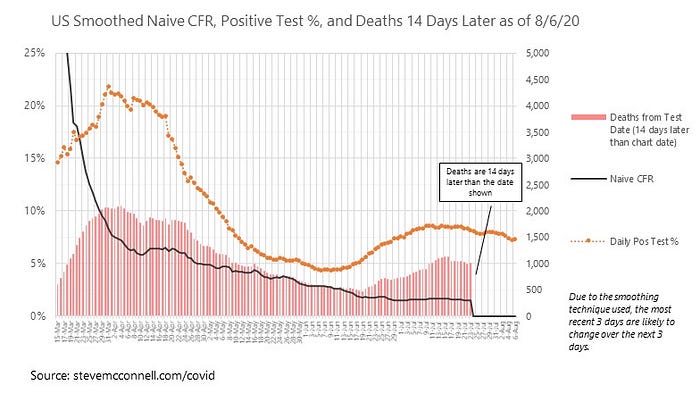
The steep decline in positive tests continues. This is true almost across the board. Deaths are still flat, but positive tests didn’t start heading down from their recent peak until July 23, so this weekend or early next week we should start to see the decline in deaths. Hospitalizations overall are down too.
This chart is the easiest to see the trend in positive tests.
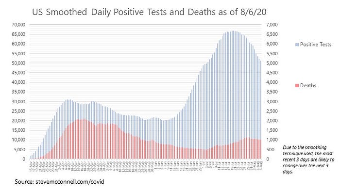
This chart shows daily positive tests and deaths using 7-day smoothing.
This is the same data without the smoothing.
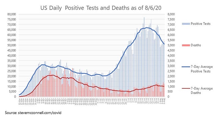
I find that the smoothed data is more accurate than the raw data (which is unusual!) because of irregularities in how states report data — especially the fact that there’s weekly cycle of underreporting and overreporting, which you can easily see in the raw data.
The crazy-looking graph below allows for comparison of timing among various factors. The y-axis is the plot of each factor against its long-term average. So in essence the chart shows whether each factor is above or below its long-term average, and whether it’s increasing or decreasing.
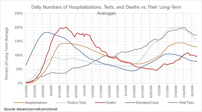
You can see all the numbers are now moving in the right direction. Positive tests are sharply down. Hospitalization is also down, but lags tests a bit. Deaths are also beginning to move down, but lag both tests and hospitalizations.
The correspondence between total tests and positive tests is interesting, and seems healthy. Positive tests peaked and started heading down, and then total tests peaked and started heading down about a week later. That suggests that testing has decreased due to finding fewer positive tests. This is born out by the positivity graph (positivity is the % of test cases that are positive), shown below.
The State Pictures
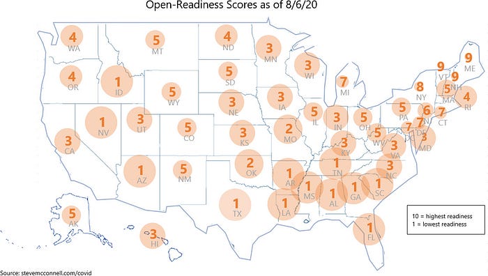
States continue to take turns being in the worst shape. The southeastern states are all still problematic from TX and OK east, but improving. Or, alternately, you could say every state in the southern half of the US is struggling except for NM and CO. The corridor from ID, NV, AZ is struggling. The coastal states on both coasts are doing somewhat better.
This is the summary of open readiness scores from the score cards I publish on my website.
This chart shows trends in positive tests cases per capita. States are sorted from west to east. The current position of each marker is the number of positive tests per 1000 population over the past 7 days. The solid bar shows where the state for the prior 7-day period (i.e., prior days 8–14, and the hollow bar shows where the state was for the 7-day period prior to that (i.e., prior days 15–21). If no bars are showing it means the state hasn’t changed much (the bars are small enough to hide behind the marker).

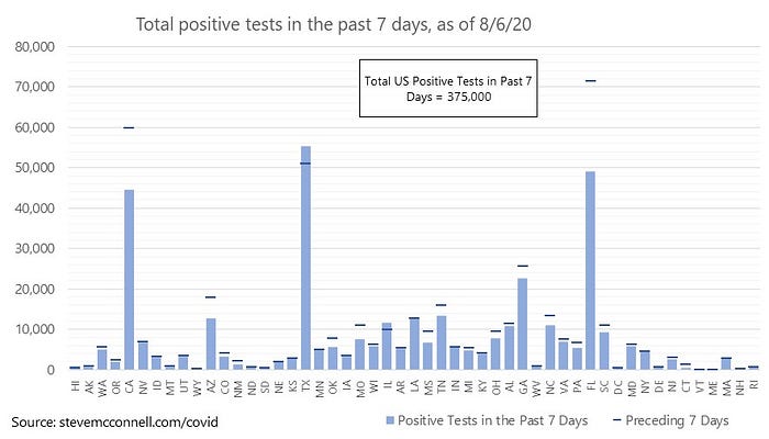
I’m including a new graph today, which is the total positive tests over the past 7 days by state. This provides a somewhat different view of the state-level picture than the tests-per-capita charts. You can easily see that CA, AZ, and FL improved week over week, whereas TX backslid somewhat.
State Estimates
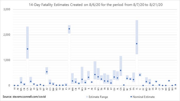
I’m also including, for the first time, a graph that shows my state-level fatality estimates for the next 14 days. This provides a different perspective on the state-level picture, e.g., FL has seen a big decrease in positive tests, but they still have some rocky days in front of them in terms of deaths. Same story in CA and TX.
National Estimates
Finally, I’m also including, for the first time, my daily automatically updated estimates. This is not necessarily what I think will happen over the next 14 days, but it is what my model thinks will happen, before I review it.
In the past, my reviewed 14-day fatality estimates have been within 25% of actuals, and most have been within 10%.

As I’ve stated before, I’ve received criticism about my fatality estimates being optimistic. But for the past several weeks the actuals have fallen below my nominal estimate and occasionally below the lower end of my range.
More Details on the Covid-19 Information Website
For more details and state-level data, check out my Covid-19 Information website.

My Background and Data Sources
I have been focused for 20 years on understanding the data analytics of software development, including quality, productivity, and estimation. The techniques I’ve learned from working with noisy data, bad data, uncertainty, and forecasting all apply to COVID-19.